Basic Examples
Provides a set of basic examples to get started with Mosaic.
🔗 Explore Basic Examples: Parameters and Descriptions
Examples
- All the examples below show the combined use of Mosaic's Plot function and other features from the widget to create a complete visualization.
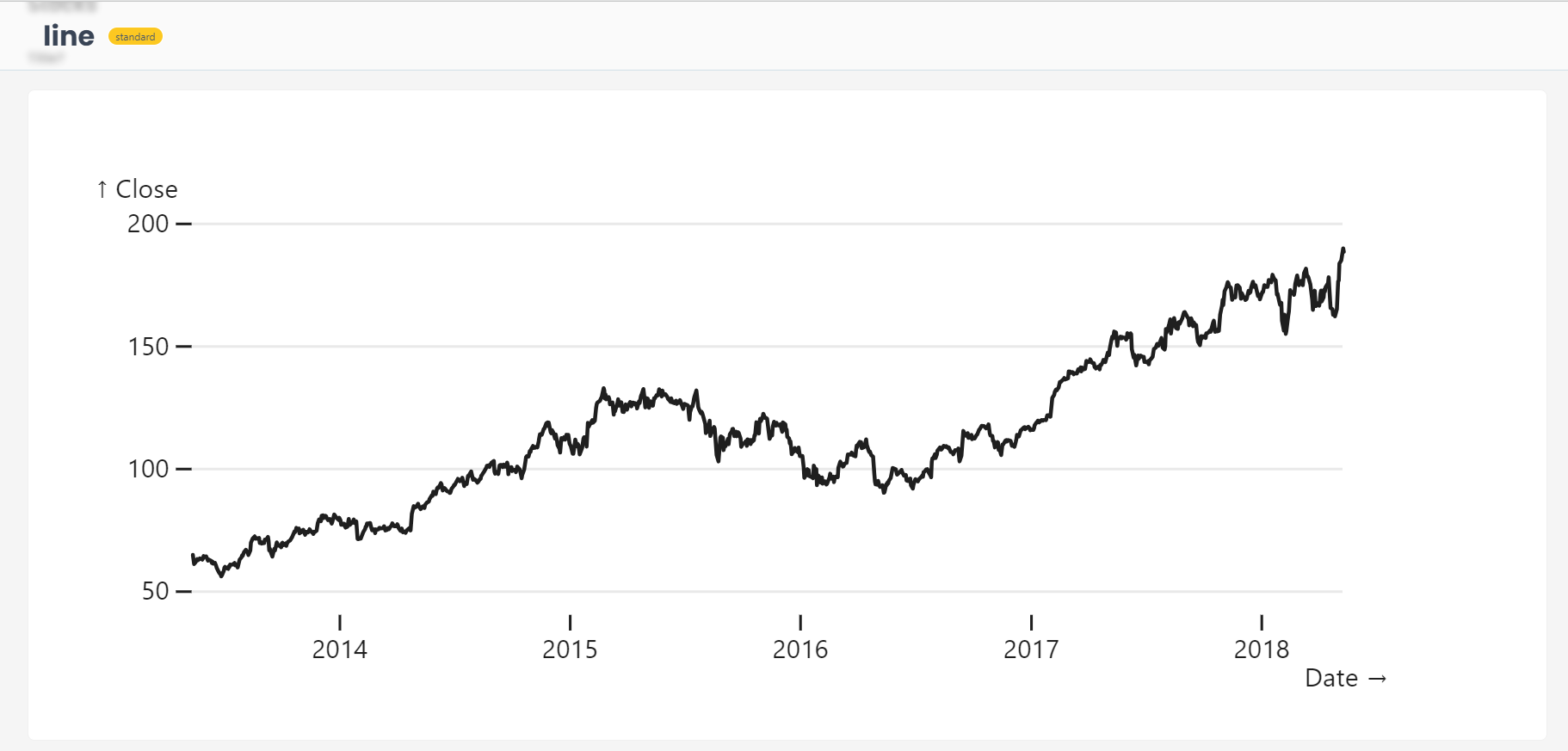
Example 1 : Basic Line Plot
from shapelets.apps import dataApp, vg

app = dataApp()

app.title('Stocks')

stocks = app.sandbox.from_parquet('stocks',  ['stocks.parquet'])
apple = app.sandbox.from_sql("SELECT * FROM stocks WHERE Symbol = 'AAPL'").with_name('apple')

app.mosaic(
    vg.plot(
        vg.marks.lineY(apple, x='Date', y='Close'),
        yGrid=True,
        yNice=True,
        width=500,
        height=200
    )
)
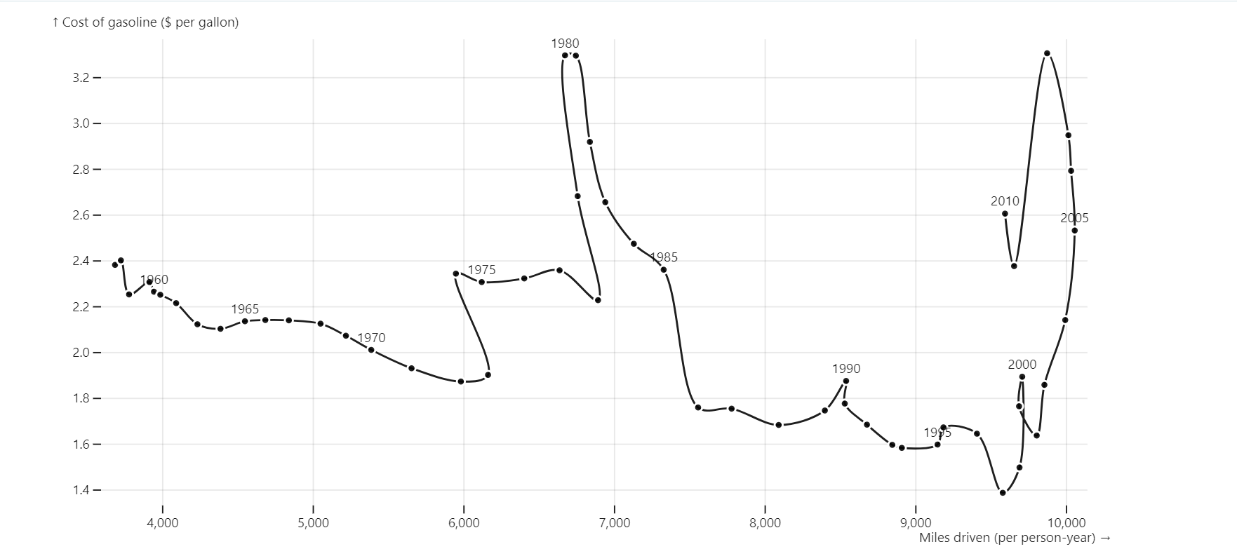
Example 2 : Shifts in Trend
- Driving Shifts
Dataset
from shapelets.apps import dataApp, vg

app = dataApp()
driving = app.sandbox.from_parquet("driving", ["driving.parquet"])

app.mosaic(
    vg.plot(
        vg.marks.line(driving, x='miles', y='gas', curve='catmull-rom', marker=True),
        vg.marks.text(driving, x='miles', y='gas', text=vg.sql('year::VARCHAR'), dy=-6, lineAnchor='bottom', filter=vg.sql('year%5=0')),
        inset=10,
        grid=True,
        xLabel='Miles driven (per person-year)',
        yLabel='Cost of gasoline ($ per gallon)',
        width=800
    )
)