Input
Allows users to input text or search queries.
Function signature
app.input(value='', addon_after=None, addon_before=None, allow_clear=False, disabled=False, max_length=None,
        placeholder='', prefix=None, show_count=False, status=None, size=None, suffix=None, variant=None,
        on_change=None)
Parameters
- Input Params
| Parameter | Description |
|---|---|
| addon_after (Union[str, VisualComponent]) | Text or control displayed after (on the right side of) the input field. |
| addon_before (Union[str, VisualComponent]) | Text or control displayed before (on the left side of) the input field. |
| allow_clear (Union[bool, IconType]) | Allows the user to clear the input content with a clear icon. |
| disabled (bool) | Disables the input, preventing user interaction. |
| max_length (int) | Sets the maximum number of characters allowed in the input. |
| placeholder (str) | The placeholder text shown inside the input when it is empty. |
| prefix (IconType) | The prefix icon displayed inside the input field. |
| show_count (bool) | Displays the character count below the input. |
| status (InputStatusType) | Sets the validation status, such as error or warning. |
| size (InputSizeType) | Defines the size of the input box (large, middle, small). |
| suffix (IconType) | The suffix icon displayed inside the input field. |
| value (str) | The current value of the input field. |
| variant (InputVariantType) | Specifies the style variant of the input (outlined, borderless, filled). |
| on_change (InputOnChange) | Callback function triggered when the input value changes. |
- InputTextArea Params
| Parameter | Description |
|---|---|
| rows (int) | Sets the initial number of rows to display in the text area. |
- InputSearch Params
| Parameter | Description |
|---|---|
| enter_button (bool) | Displays an enter button after the input, conflicting with the addon_after property. |
| loading (bool) | Indicates a loading state for the search input. |
| on_search (InputOnSearch) | Callback function triggered when a search is performed (e.g., pressing Enter or clicking the search icon). |
- Input Password Params
| Parameter | Description |
|---|---|
| visibility_toggle (bool) | Shows a toggle button to control the visibility of the password. |
Examples
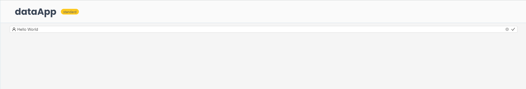
Example 1 - Basic Input
This first example below shows how to create input components.
from shapelets.apps import dataApp, IconCodes

# Set up Data App
app = dataApp()

# Basic Input example
basic_input = app.input(
    placeholder="Type something here",
    value="Hello World",
    allow_clear=True,
    size="small",
    prefix=IconCodes.UserOutlined,
    suffix=IconCodes.CheckOutlined,
    on_change=lambda src, value: print(f"Input changed to: {value}")
)
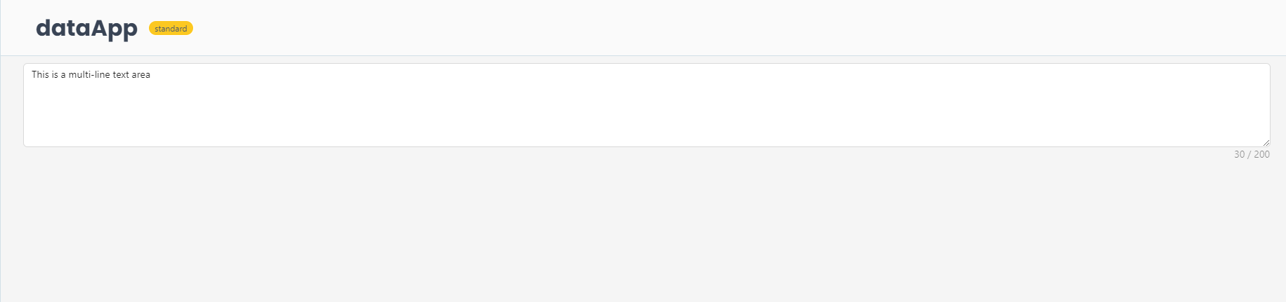
Example 2 - Input Text Area
This example shows how to create a multi-line text area.
from shapelets.apps import dataApp, serve

# Set up Data App
app = dataApp()

# Input Text Area Example
text_area = app.input_text_area(
    placeholder="Enter your text here",
    value="This is a multi-line text area",
    rows=5,
    show_count=True,
    max_length=200
)
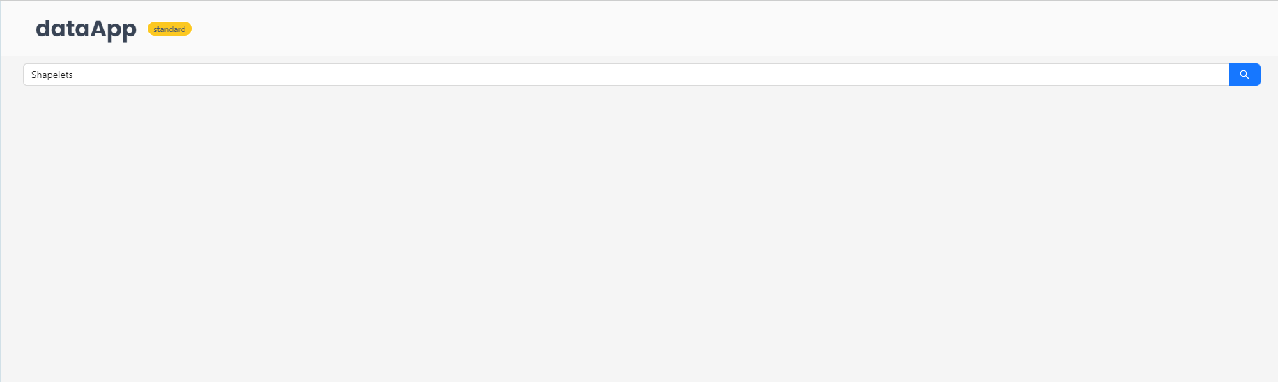
Example 3 - Input Search
from shapelets.apps import dataApp, serve

# Set up Data App
app = dataApp()

# Input Search Example
search_input = app.input_search(
    placeholder="Search...",
    enter_button=True,
    loading=False,
    on_search=lambda src, value: print(f"Search initiated for: {value}")
)

if __name__ == "__main__":
    serve(app)
Example 4 - Input Password
from shapelets.apps import dataApp, serve

# Set up Data App
app = dataApp()

# Input Password Example
password_input = app.input_password(
    placeholder="Enter your password",
    visibility_toggle=True,
    on_change=lambda src, value: print(f"Password changed to: {value}")
)
