Slider
Allows users to set a range of values by moving a thumb along a track.
Function signature
app.slider(value=None, disabled=False, marks=None, max=100, min=0, step=None, range=False, vertical=False,
          on_change=None, on_change_complete= None)
Parameters
| Parameter | Description |
|---|---|
| value (Optional[SliderValueType]) | The default value of the slider |
| disabled (bool) | If true, the slider will not be interactable |
| marks (SliderMarksType) | Tick mark of the slider |
| max (int) | Maximum value of the slider |
| min (int) | Minimum value of the slider |
| step (Optional[int]) | Granularity the slider can step through values |
| range (bool) | Dual thumb mode |
| vertical (bool) | If true, the slider will be vertical |
| on_change (Callable[[float], None]) | Callback function that is fired when the value of the slider is being changed |
| on_change_complete (Callable[[float], None]) | Callback function that is fired when mouseup or keyup is pressed |
Example
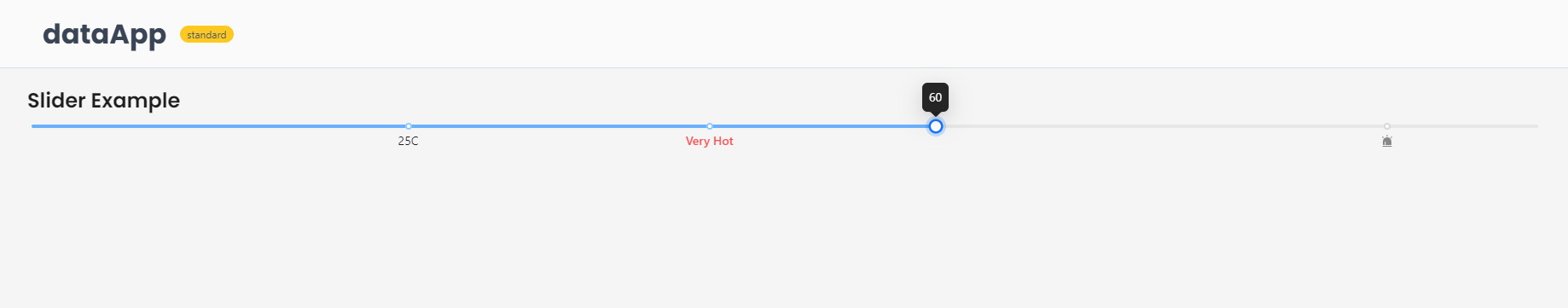
The example below shows how to create a slider component.
from shapelets.apps import IconCodes, Slider, dataApp, icon, serve, text

# Set up Data App
app = dataApp()

# Set the title of the app
app.title('Slider Example')

# Create a slider and set its properties
slider = app.slider()
slider.min = 0
slider.max = 100
slider.step = None
slider.value = 20
slider.range = False
slider.draggable_track = True
slider.marks = {
    25: '25C',
    45: text('Very Hot', strong=True, role='danger'),
    90: icon(IconCodes.AlertFilled),
}