Select
Allows users a dropdown menu with various options for selection.
Function signature
app.select(allow_clear=False, auto_clear_search_value=False, auto_focus=False, default_active_first_option=False,
        disabled=False, filter_option=False, list_height=256 loading=False, max_count=None, max_tag_count=None,
        max_tag_placeholder=None, max_tag_text_length=None, menu_item_selected_icon=None, mode='single',
        not_found_content='Not Found', option_filter_prop='value', option_label_prop='label',
        options=[], placeholder='Select', placement='bottom-start', remove_icon=None,
        search_value='', show_search=False, size='middle', status=None,
        suffix_icon=None, token_separators=[','], value=None,
        variant='outlined', virtual=False,
        on_change=None, on_select=None,
        on_deselect=None, on_clear=None,
        on_search=None)
Parameters
| Parameter | Description |
|---|---|
| allow_clear (Union[bool, IconType]) | Selection to be clear, also with a custom clear icon. |
| auto_clear_search_value (bool) | Clears the search input when an item is selected. |
| auto_focus (bool) | Focuses the select input when the page loads. |
| default_active_first_option (bool) | Activates the first option by default when the dropdown opens. |
| disabled (bool) | Disables the select input, preventing user interaction. |
| filter_option (bool) | Filters options based on the input when true. |
| list_height (int) | Sets the height of the dropdown list. |
| loading (bool) | Displays a loading state for the select input. |
| max_count (int) | Limits the maximum number of items that can be selected. |
| max_tag_count (SelectMaxTagCountType) | Limits the number of tags displayed in the selection, with an option to show more tags. |
| max_tag_placeholder (VisualComponent) | Custom placeholder for hidden tags when the max tag count is exceeded. |
| max_tag_text_length (int) | Limits the length of tag text shown in the select input. |
| menu_item_selected_icon (IconType) | Custom icon displayed for selected menu items. |
| mode (SelectModeType) | Determines whether multiple or tag selection modes are enabled. |
| not_found_content (Union[str, VisualComponent]) | Content displayed when no options match the search query. |
| option_filter_prop (str) | Property used for filtering options when filterOption is true. |
| option_label_prop (str) | Property used to render the label of each option. |
| options (Union[Sequence[str], Sequence[SelectOption]]) | List of options available for selection, either as strings or SelectOption objects. |
| placeholder (str) | Placeholder text shown when no option is selected. |
| placement (SelectPlacementType) | Position where the dropdown menu appears relative to the select input. |
| remove_icon (IconType) | Custom icon for removing selected items. |
| search_value (str) | Current search text input by the user. |
| show_search (bool) | Enables searching within the dropdown options. |
| size (SelectSizeType) | Size of the select input (e.g., large, middle, small). |
| status (SelectStatusType) | Validation status of the select input, such as error or warning. |
| suffix_icon (IconType) | Custom icon displayed at the end of the select input. |
| token_separators (List[str]) | Separators used to tokenize input for multi-selection. |
| value (Sequence[str]) | Currently selected values. |
| variant (SelectVariantType) | Style variant of the select input (e.g., outlined, borderless, filled). |
| virtual (bool) | Enables or disables virtual scrolling for the dropdown options. |
| on_change (SelectOnChange) | Callback function triggered when the selected value changes. |
| on_select (SelectOnSelection) | Callback function triggered when an item is selected in multiple or tag mode. |
| on_deselect (SelectOnDeselection) | Callback function triggered when an item is deselected in multiple or tag mode. |
| on_clear (SelectOnClear) | Callback function triggered when the selection is cleared. |
| on_search (SelectOnSearch) | Callback function for handling searches within the select input. |
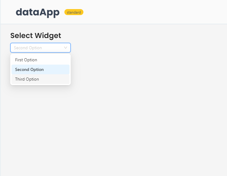
Example
The example below shows how to create a basic select dropdown.
from shapelets.apps import dataApp, SelectOption

# Set up Data App
app = dataApp()

# Set the title of the app
app.title(text='Select Widget')

# Display select component
app.select(
    options=[
        SelectOption('first_option', 'First Option'),
        SelectOption('second_option', 'Second Option'),
        SelectOption('third_option', 'Third Option')
    ],
    value=['First Option'],
    cssStyles={'width': '200px'}
)