Input Number
Allows users to input numerical values.
Function signature
app.input_number(addon_after=None, addon_before=None,prefix=None, up_icon=None, down_icon=None, auto_focus=False,
                change_on_blur=False, change_on_wheel=False, show_controls=True, decimal_separator='.',
                disabled=False, keyboard=True, max=None, min=None, placeholder='',
                precision=None, read_only=False, status=None, size='middle',
                step=1, value=0, variant='outlined', on_change=None)
Parameters
| Parameter | Description |
|---|---|
| addon_after (Union[str, VisualComponent]) | Text or control displayed after (on the right side of) the input field. |
| addon_before (Union[str, VisualComponent]) | Text or control displayed before (on the left side of) the input field. |
| prefix (IconType) | The prefix icon for the input field. |
| up_icon (IconType) | The icon for the button that increases the input value. |
| down_icon (IconType) | The icon for the button that decreases the input value. |
| auto_focus (bool) | Focuses the input when the component is mounted. |
| change_on_blur (bool) | Triggers the onChange event when the input loses focus. |
| change_on_wheel (bool) | Allows control of the value with the mouse wheel. |
| show_controls (bool) | Displays the up and down buttons if True. |
| decimal_separator (str) | Specifies the character used as the decimal separator. |
| disabled (bool) | Disables the input, preventing user interaction. |
| keyboard (bool) | Enables keyboard behavior for input value control. |
| max (float) | Sets the maximum value allowed for the input. |
| min (float) | Sets the minimum value allowed for the input. |
| placeholder (str) | The placeholder text displayed in the input when it is empty. |
| precision (int) | Specifies the number of decimal places to display. |
| read_only (bool) | Makes the input field read-only, preventing value changes. |
| status (NumberInputStatusType) | Sets the validation status (e.g., error or warning). |
| size (NumberInputSizeType) | Defines the size of the input field (large, middle, small). |
| step (float) | Sets the step value for incrementing or decrementing the input value. |
| value (float) | The current value of the input field. |
| variant (NumberInputVariantType) | Specifies the style variant of the input (outlined, borderless, filled). |
| on_change (NumberInputOnChange) | Callback function triggered when the value of the input changes. |
Example
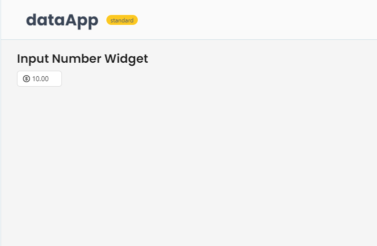
The example below shows how to create a basic input number widget.
from shapelets.apps import dataApp, IconCodes

# Set up Data App
app = dataApp()

# Set the title of the app
app.title("Input Number Widget")

num_input = app.input_number(
    value=10,
    min=0,
    max=100,
    step=5,
    size='middle',
    prefix=IconCodes.DollarCircleOutlined,
    up_icon=IconCodes.PlusOutlined,
    down_icon=IconCodes.MinusOutlined,
    placeholder="Enter a number",
    precision=2,
    on_change=lambda src, value: print(f"Value changed to: {value}")
)